
SESSION
The Frontend Friday Feud
The Virtual Coffee community has been supporting developers at all stages of their career for 5 years. Join their first ever conference for sessions about code, careers and community.
 Martine Dowden
&
Martine Dowden
&
For years I repeated the same phrase, “You can’t style an element based on its descendant’s class or state”, and I can clearly recall thinking we never would. With the introduction of :has(), I now need to change my tune. As new properties are being added to CSS, we can do so much more than we used to. We recently saw grid and flexbox added to our styling toolbox but we didn’t stop there. In this talk we will look at some of the new properties, pseudo-classes, and techniques that have recently become available and how we can apply them to our projects.
Focusing on web interfaces that are beautiful, functional, accessible, and usable, Martine approaches User Experience from both Art and Science, drawing from her degrees in Psychology and Visual Communications. She is a Web Technologies, Firebase, and Angular GDE as well as a Microsoft MVP in Developer Technologies. Martine stays active in the industry by writing articles, leading workshops, and speaking at conferences and meetups worldwide. An accomplished author, her latest book, Tiny CSS Projects was released in 2023.
Martine Dowden 0:03
Oh, hello, everyone, we are going to. So CSS has a scope for. But today, what we’re going to do is we’re going to talk about the new features that are coming up in CSS. Some of them have been implemented already. Some of them have not, or are partially implemented in the browser. So we’re also gonna talk about what are what’s the current support? Right? It’s so I always kind of
Martine Dowden 5:44
wishy washy, I’m always a little bit wishy washy about whether or not I want to present on things that we can’t use yet. And so I, but I’ve come to terms with, if we don’t know what’s coming, we can’t architect our code to potentially allow for it in the future. If we also it might. So definitely can implement affect our implementation decisions. And also, it’s cool, it’s fun to find out what’s coming up.
Martine Dowden 6:13
So my name is Martine Dowden, I am a Google GD and Microsoft MVP, I have been coding for a while. And my background is actually in psychology, I started in, I started in Psych, and then got into Web as in the UX and UI and got further further into the code. And there you go. And here I am today, my passion obviously, is in CSS in front end and neck in accessibility. And if you want to find more about me go to Martine dot Dev, it’s got all of my publications, and all of my information, what I’m where I’m going to be speaking at, etcetera, etcetera, etcetera. But back to why you’re actually here, CSS. So one of the new things that’s come out recently is the is new pseudo classes that allow us to select elements and those new ones is where has in the additions to the nth child syntax allows us to select things in ways that we were not able to do before. So let’s look at these a little bit more closely. The first one is, is and where I kind of put these together because they’re very similar in what they do. And they take a list of arguments. So you can pass in anything, you can pass in classes, you can pass and select your classes ID the same way you would any other selector. Essentially, it’s going to apply those styles to anything in that list. The thing is, there’s a little bit of a difference in how they work when it comes to specificity. In the in. When we calculate specificity, let’s put where it is aside for two seconds. And let’s talk about specificity itself and how we calculate it because I know that can be a little bit of a difficult topic at times, it’s something that is something a little bit difficult to understand, but there’s actually math behind it. And so what we do is if we look over here, the we have three different selectors right in our in our three different pieces in our selector. And we can based on that there’s number values that get attributed to him. So if we take, we have no IDs in here, so zero, then we look at our classes, pseudo class attributes and pseudo class attributes. So we have two, right, we have a class and we have a pseudo class, we have the Adult Link. And then we look at our elements, right, we have Section A, so those are elements. And so based on that, we come up with the numbers 022. And so what we do is we compare, the first number of the first number is the same, then we compare the second number, the same number, the second number is the same, then we compare the third, right, and so if those if basically, the level of specificity is the same, then it has to do with the order of application in the style sheet, right, the the last one wins. And so based on those numbers, we can actually calculate specificity. The cool thing about where is that it doesn’t matter what you have in that list, the specificity is always going to be zero. So rare is really, really cool for things like when you are wanting to create base styles for certain elements, because it’s going to be super easy to override longterm because it has a specificity of zero. Anything that gets applied after it is going to override it, no problem is is a little bit more dangerous to look at, because is, excuse me, is going to have as its specificity, anything that’s within it, we’re going to look at anything that’s within those arguments being passed, and it’s going to be the most specific one. So in this case, I have an element. So an element in and of itself has a specificity of 001. Right? If we look at our trusty little cubes over here, a class which has 010 and then an ID which is kind of the most specific thing we can have right, which is going to be a 100. So the specificity for this entire piece or for any
Martine Dowden 10:00
This, any of this code would be 100. Much harder to go ahead and override at that point. So it’s by default, what I tell tend to tell people is if you can use where and then if you need that specificity then use is but you got to be very careful about when to use which ones because you could easily get in a situation where if you do need to override some styles for a specific use case, it’s going to become very difficult because you might, depending on what you have, inside of your parameters, that specificity can become quite specific. And we end up with quite a large number. So let’s look at some examples of why we might use where or is now these could work where either right one of the places I really like to use them in is where we’re doing, for example, a link right where we want a link and visited, that often comes into play when we’re styling them. Because the blue blue with the default colors, probably not what we want, if we have some brand colors we need to follow, we might want to do some fun things from the underlying whatever the case might be. So that’s a really good use case. So where n is are really nice, because you can put them in the middle of a chain, right and not have to copy and paste that that beginning trunk of that chain like 100 times in order to get to go ahead and put in your list of elements.
Martine Dowden 11:22
Support on it is quite good. So I took these from can I use most of the screenshots on support that I took our phone can I use, they still show IE, I’m just going to ignore it. Because I don’t know about y’all. But I thoroughly celebrated when I went away, and I don’t ever want to look back. But as we can see our major browsers, Chrome edge Safari, Firefox, and Opera do have support for both isn’t where you’re looking at 97% of the population, right has access to is and 94 for aware. So we’re in pretty good shape with that at this point, these are some things we can definitely start using, obviously your user, be conscious of your user base, and make sure that it’s going to work for you. But as a general rule, these are pretty well supported across the board at this time.
Martine Dowden 12:16
We another one that we have now is has so I’m gonna pause for a little bit of a story before I go into exactly what has does. But when I first started CSS I used to say, and I used to tell people like you’re never going to be able to select based on a child, right? It’s never going to happen. We’re never going to be able to do that it’s always top down, you’re never going to be able to write a selector based on what’s going on with a child. Well, that’s no longer true. I’ve had to re recant that statement.
Martine Dowden 12:46
Because we can now can we can look at a child element, we can also look at a sibling element and based on what’s happening with the child. So this first one looks at a section that has a child in there somewhere that is a URL, or this one hat is a section that has a sibling that is a URL, right, we can look at what happens further in or past. So this becomes really, really interesting because now we can conditionally write CSS based on what’s going on inside of that element, which we’ve never been able to do.
Martine Dowden 13:20
Not without JavaScript anyway. So one of the places I really like to use it is, for example, in the context of a form if I have a label, and I have my nested input and my label information, right, I can say, hey, anytime something inside of that label has an attribute. So this is an attribute selector, right. So the label has an attribute selector before my label, I want to add that little red star, right. So this allows me to programmatically start doing some style things which historically, we’ve in this example, specifically, we had to add that HTML and remember to add the HTML and remember the add this dollar, every time an input got required, and if it was dynamic, then we had to worry about the star being dynamic and so on. Now we can let the CSS take care of all of that. That’s just one example of using has
Martine Dowden 14:13
but it’s one that I tend to use a lot which is why I chose it.
Martine Dowden 14:18
Here you have the example if we don’t necessarily labels which I know we can’t always nest the inputs inside of our labels. We can actually go and say and look at that and look at that sibling and says if it has a sibling that has a property of required than before, so I know this looks kind of weird, right putting that right there in our in our in our has right inside of our parentheses, but we can absolutely do that to go ahead and get the sibling and add the add the the the star in there.
Martine Dowden 14:57
The support on that isn’t awesome awesome quite yet
Martine Dowden 15:00
No, it’s at 91%. So we’re getting really, really close. The problem is in some of the more the more mobile browsers, but when you’re talking about standard web we’re looking at we’re getting there, right, we’re starting to, if your population is definitely going to be on modern browsers, and definitely updating their browsers, you’re starting to get into a situation where it’s definitely starting to be usable. Firefox had been the holdout for quite some time, and needed flags. But we’re finally there. So that’s one that we can definitely start using sooner rather than later. But keep in mind, it’s only still only 91% of the global population. So you’ll definitely want to check what’s the dominant browsers your users are using.
Martine Dowden 15:44
The last one in our selectors that we’re going to talk about is in the in syntax. So anthem child has existed for quite some time, but it was always based on the element, right? So nth of, and child would be what would did not allow us to specify anything about the element. Now we can go ahead and say I want the nth child, but I only want the active element. So I only want something like I can base it off the class. So in this case, I could also basis basis often attribute for examples, any kind of selector really. So in this case, I’m looking at, I want the third child, but that is an owl that has a class of active. So I can be even more selective when I’m looking at my children, the children, and looking for a specific and specific child instead of it just being children as a whole. So that’s really cool.
Martine Dowden 16:40
Um, the support on that is pretty good. Unfortunately, I was not able to find it on can I use, so I can’t exactly give you the global stats on it. But it is available across all modern browsers, at least the latest versions, so that is super cool.
Martine Dowden 16:56
So that’s for our selectors. The another way that we have found that we can conditionally apply some CSS is through container grades, container queries are really awesome for things like when you have when you’re trying to create component based styles, but your component may live anywhere inside of your, you know, could be dropped anywhere, the good old of concept of a widget, right, you can stick it anywhere in your application, you don’t necessarily know what the context is going to be in terms of size. So now we have to account for that. And container queries allow us to write CSS not just based on the view size, but on the container of the element size, which is really nice. So container, the container is going to have to get defined, right, you have to tell it what the container is, you can optionally give your container a name, which makes it a little bit easier to read the code and or reference it later. But you basically have different types of containers, because you’re going to have to define that as a container, right? We’re going to define my the container around our elements. So we can tell it what we’re like, what is it that we’re going to size, and then we have inline size versus size and normal. So inline size versus size has to do with, not to vertical and horizontal, the way we’re typically used to thinking in terms of some some of the CSS aspects, but in terms of, if you look at the direction of writing in line is going to be the direction of writing. And the size is going to be both directions, but more and handle your other direction. So if you’re looking at some languages that may right top to bottom, right, like some of the some Asian languages, I can’t think of one off the top of my head, but some languages are written top to bottom instead of left to right or right to left, then that case, your inline size would be your vertical if the language is written from top to bottom. So it has to do with the direction of your language. Once you’ve established what your container is, so in this case, if we look at these tags, right, if I have a an element that is an element for tags, and I want it to be able to be anywhere, but if it’s in a small area, if the if the area is narrow, I want it to stack them. If the area is wide enough, I want them in line, right, I can go ahead and write set that I’m my container, I go ahead and give it a type, right, because I have to define how it’s going to resize. And then I can say container, mid width, yada, yada, yada. And that goes ahead and allows me to conditionally write my normal tag code versus my, hey, if my container is smaller than is has a is smaller than 350 pixels. Go ahead and apply these styles instead. So the the container query aspect of it is very similar to immediate query. You’re going to do your min width, you’re going to do your max width. All of those are very much available the same way as for a media query.
Martine Dowden 20:02
The support on it is across the board. Um, we even got a little badge on can I use, which is super cool. That’s as baseline 2023, newly available across major browsers. So it is definitely there, we’re looking at 91% of the population with it. So that’s something that because you still have about, you know, 10% of your population, so I’m rounding that do not have access to it quite yet, it’s probably something you’re gonna want to fall back for. But other than that, it works.
Martine Dowden 20:33
As long as people have the latest and greatest, you’re looking at the major browsers habit, which is super cool.
Martine Dowden 20:41
Container styles are similar to Container query. So the container query that we just talked about was related to set the size, this one is related to adding a custom property. So the use case for that I’m not, I haven’t exactly found a really, really good one. Personally, I ended up reverting to just give the thing a just given thing, a different class based on your type. But I would suppose like, I can see how in maybe a CMS system, for example, you might not be able to do that quite as easily, depending on the output. However, basically, what this does, is allows us to set to look for, do you have a particular custom property or CSS variable, right, and if that custom property is equal to whatever in, then go ahead and apply these styles. So it allows us to set a custom property one place, and then basically have it trickle down the application and conditionally style things based on that. So in this case, case, I have a bunch of little different tiles, which are given a style with a custom property, depending on what it is, and then you can style accordingly, right. So that’s a way to either style an element or style, you know, change your application, maybe that could be one way to think things, for example, based on a theme custom property getting set somewhere.
Martine Dowden 22:06
But that one does not have near as good support. So Safari and Firefox are still out. So that kind of cramps our style, right, because if you don’t have Safari and Firefox, if you’re just Chrome and edge, you’re lonely. In this case, you’re only looking at about 69% of the population. So that that one is definitely still experimental and something that you might want to play around with, but probably not quite ready for primetime. Unless you know for a fact that 100% of your users on either Chrome edge, which is outside of maybe an internal tool or something is probably unlikely.
Martine Dowden 22:46
Nesting, so away from selectors and selecting things, let’s look at nesting. So I don’t know about y’all, but it’s actually very rare for me to write pure CSS anymore. Generally speaking, I’m using some kind of pre compiler or transpiler. Or we can have wars about what it’s called all day long. But essentially, I’m using most of the time, I’m using Sass, although you have stylus or, or less as well, that were quite well. But what those allow us to do is nest our CSS, right, we can go ahead and in order to group things, we can go ahead and nest things inside instead of having to repeat right instead of having the card and card header, and so on. As we go down the line, I can go ahead and nest them this way. Well, that is actually coming to CSS here very, very soon. So that we will be able to do that without having to use a some kind of pre compiler, which will be super cool. So this is an example of it. If for SCSS, it works perfectly fine, I can go ahead and have my container, and then go ahead and nest all of it. And it’s all like everything related to my card, including its container, its container query, and everything can be neatly nested, so that I can determine what I’m going to do with my styles. So this in terms of what I really like it for one, it decreases the verbosity a little bit, but it also goes ahead and helps with things like keeping code together. Where the pitfalls happen is if you start nesting and nesting and nesting and nesting and nesting you get, you get the extra specificity of it, right. So if the code starts looking like, like an arrow, or some people may call it a Christmas tree, you might want to reconsider how deep your nesting is. And that’s that’s been true even in SAS lesson, the other compilers that let us nest that’s going to be that’s been true historically, and continues to be true with CSS.
Martine Dowden 24:48
The support on that is starting to get there. We’re looking at 83% of the population. It is across the latest versions of all major browsers, at least on the website. We’re still kind of lagging on the web aspect of things. But your your main ones like Chrome on Android Safari on Android, and your webs are there. So we can slowly mature to start using that the problem with this is there’s not really a really good fallback. We might I haven’t found doesn’t mean there isn’t one yet. But last time I looked, I hadn’t found a,
Martine Dowden 25:25
I hadn’t found a nice way to do a fallback for that. So there you go. But that is definitely coming very, very soon, to the broader usage, which will be really cool.
Martine Dowden 25:39
Um, typography.
Martine Dowden 25:44
Typography is a topic that some, anybody that knows me has probably heard me talk about before, because it’s one I’m very, very passionate about. So I’m really, really excited about the new features there. So let’s hop right in text balance on text rep balance, specifically. And I find this one particularly cool because it allows the browser to kind of determine, instead of having the concept of a an orphan right here, right, we have this little this one like this one where that ends up stuck in the stuck at the ends. And that’s not visually particularly pleasing to have this very long line. And in this one word at the bottom, what text wrap balance allows, it allows the students just tell the browser, Hey, if when we get into a situation like this balance out my text, right, make it so that my line lengths are going to be roughly equal and prevent and it’s which is going to prevent this kind of like, you know, having one word dangling at the end. So it’s really, really nice for things like titles and headers specifically, is one of the use cases that I have found.
Martine Dowden 26:52
I have found that is really useful. And the big reason why right now, it’s pretty much going to be for titles and headers. And that sort of thing is because it is the number of lines that it will calculate on as a maximum of, at least in Chromium for the maximum is going to be browser specific. So the number so if you’re let’s say you have a long paragraph, right, that is, you know, dozens of lines, talks about text, that balance won’t do anything for you. It’s specifically for short bits of text. So the real use case is things like titles and headers.
Martine Dowden 27:27
Support on it isn’t great, um, it’s coming. Seems like a safari will get it to us at some point. soonish. I mean, it’s it’s definitely there in the, it’s there. They’re talking about it, right, it’s there. But it’s still kind of sketch. The good news, though, is it’s one of those things that if a browser doesn’t have it, you can put a text right balance. And eventually when the browser receives it, or the user uses that the ads that functionality, then it goes ahead and applies itself. So it’s one of those things that although not exactly across the board isn’t going to unlike you know, not having container queries or nesting not being applied this one as well. You’ll get it when you get it type of situation and won’t look as good for you. But it’ll it’ll get there.
Martine Dowden 28:16
initial letter is really cool. That one allows us it’s more related to be able to manipulate how the first letter of something happened. So we’ve had first letter for a long time. And we’ve been able to add style, specifically to the first letter of a paragraph or div or whatever, for quite some time. However, for things like drop caps, so if you think a drop cap is if you’re looking at
Martine Dowden 28:44
Think of the old Illuminations, right, the old manuscripts from the Middle Ages, and so on that first letter on those manuscripts with gorgeously ornate, right?
Martine Dowden 28:56
Obviously, that would have to be done with an image in CSS, but we can’t actually style that first letter in ways to make to kind of bring back that concept of the drop cap. So what initial letter which would be used, you know, in conjunction with first letter allows us to do is it looks at how many lines do we want that first letter to span? And if we want to sync so if I have, if I have a letter that is three lines tall? Do I want it to go ahead and sink down three lines? Or do I only want it to sink down two lines and kind of stick up at the top? So let’s kind of look at what that’s going to look like.
Martine Dowden 29:36
So we have two examples here. So this is what I was talking about with the sink right? The first example I have and in my initial letter, I simply gave it a number three. So I can shorthand that and say, if you only give it one number, that’s going to apply an equal amount of lines in an equal amount of sync. So my letter here for my it’s what’s the paragraph first of types and my first pair that first letter, right, so it’s this URL. And it’s going to be it’s three lines tall, and it’s sunk three lines. So it’s all the way down. So it’s flush, right? With my text. In this case, I’ve given it two properties. I’ve told it, I want it to be three lines tall, but I only want you to sync two lines, which means that I have one month’s worth of whitespace. On top. Right. So that allows us to play with how far down we wanted to go, we could actually sink it more, right? If we wanted to, if I had given like a property of four here, it would have an extra bit of whitespace on top. But this allows us to do what previously we were having to use float and a bunch of other various techniques to go ahead and style. Now it comes baked in, which is really super cool.
Martine Dowden 30:48
The support on that as well, not ready for primetime, let’s just say it’s very much still experimental. We’re looking at only, and this is the important here, the non the, the unprefixed is complete garbage, right, you’re looking at 2.28% on on prefix, that’s, that’s really not good. So yeah, we’re not quite there yet. So if you do want to play with that, look up what the support is for the browser that you’re using. And you may or may not have to set some flags in order for and allow some flags on your browser settings to do that. If you are a web developer, and you start playing with flags, I made this mistake. So I will let you as early on in my career. So I will share the love and prevent you from making the same. Give yourself two different browsers that you play in. So let’s say I have Chrome and Chromium on my computer, or you can have because I’m on Linux, but you could have Chrome vs. Canary, for example. Keep one of them standard base everyday, because when you’re doing your testing for your actual like stuff that you’re pushing out, you want the same kind of environment your users are going to have, and then have that browser that you muck with. For Firefox, I have the regular Firefox will keep clean, and the developer Firefox, which I go ahead and play with all the flags, right? Make sure you’re either resetting your flags when you’re done, or go ahead and have two different browsers that way, you know, you have your playground, and you have your one to do legitimate user testing. And because otherwise, you’re going to be like what works on my machine and all of your users gonna be like, it doesn’t work for us. And it took me a while to figure out that’s what had happened in that use case. So be aware of that, once you start playing with flags, you will no longer have the same behavior as the average user, right, because most people don’t go around playing with the new feature flags in their browsers,
Martine Dowden 32:46
the transform property, so we’ve had transform for quite some, some time in terms of a value and a function that we could pass in CSS, now we have it as a property. So that allows us to shorthand what we used to do. So basically, this is what we’ve, we’ve been able to do for quite some time, or you said transform, rotate, transform, whatever translate scale, now we can just pass it as a single property. So if we’re not trying to, even if we were to chain like a translate and or scale or whatever, we no longer have to have this, it’s just a shorthand, it’s still a stick the the actual behaviors stays the same. It’s just a little bit less verbose to type. But it’s pretty cool. And then that support on it is quite good at this point. I mean, we’re looking at across all major browsers being able to use those properties, at least on the newer versions. So that one’s pretty much there. But I do find that there’s benefits, I’m going to go back here, there’s benefits pros and cons to having it both ways. The having all of your transforms in one place can be pretty nice. It also allows for if you’re doing any kind of animations, you can animate on transform, which allows you to animate on everything and that transform chain.
Martine Dowden 34:04
Excuse me. However, if you individualize them, it means that now you can animate just the Rotate, for example. So it really just depends on what your preference in terms of reading it and or what you’re trying to do with it. Right.
Martine Dowden 34:19
So talking about animation, let’s talk about scroll driven animations, which are brand new, and really, really cool. Somebody should I should start counting how many times this is things are really, really cool in this presentation. Because I mean, to me, it’s all really, really cool.
Martine Dowden 34:36
So scroll timeline, and animation timeline, the combination of the two basically allowed us to create an animation, which the timeline of which is tied to your scroll. So let’s say you’re scrolling. So generally, when you create an animation, you’re going to give it a time, right I want it to execute in X amount of time. In this case, what it’s going to do is your percent on that animation, so how far into the animation you go is going to be tied to your scroll. So how far down you scroll. So if you scroll 50%, down the page, you’d be 50% through your animation, which is super cool.
Martine Dowden 35:12
The thing is, you’re going to give it an axis on which direction you’re going to scroll, because you can give it you’re gonna want to know like, when it’s going to trigger, right, and you’re going to also you can do an insert, which is how far into the progress you’re gonna go. So let’s take a look at all of this in terms of code.
Martine Dowden 35:33
What we have here is I have a progress time bar. And I’m going to increase the width of that progress timeline based on how far down my page I scroll. So for the concept of maybe, let’s say it’s an article, and I want to know how far down the article I am, or maybe I’m filling out a really long form. And I want to know how far how much progress I’ve made down this form, I can go ahead and create that progress. So in this case, you’ll see that the I’m also changing colors as I scroll just because but the in this case here is that girl progress for that, that increases in decreases, right, I’m simply doing a scale, when I’m at zero, I’m going to scale to zero. And when I’m at one, I’m going to scale to One, I’m simply scaling the width of this bar, where this gets interesting is here, right? I’m gonna say that the animation is called growth progress. That’s the name of my animation, I’m gonna let the browser do it, it’s going to do and I want it linear, right? The same way as before we have, we can say if I want it, if we want it, you know, ease in and out, etcetera, etcetera, we still do that. And then the animation timeline, this is what tells it how to animate, I want to add a mane on scroll. And that’s going to go ahead and tell it instead of giving it a time, which usually the second animation you’d give it, you know, two seconds, five seconds, whatever the case might be, oftentimes or more in milliseconds, but there you go, this is going to tell it to scroll. Now notice here, I also have done the same thing on the background. So as it scrolled the background color changes, this is the second animation. So you can have multiple animations all based on the scroll of that animation.
Martine Dowden 37:19
So that is one way to do it. The other way, is if we wanted to do something more parallax related. So in this case, as you scroll, I’m forcing the colors of these rectangles to stay to stay put and to keep my gradient. So in this case, I’ve given I’ve told it that the background, rather the background for my for each of my containers, now each of these rectangle containers, it goes from pill, pill, golden rod to pill turquoise.
Martine Dowden 37:51
And then when I’m doing instance here, my timeline animation instead of scroll is you block. So I’ve been essentially telling it, I want you to stay put and as it scrolls, you’re going to increase through my animation, you’re going to increase through my animation, right. So that’s why even though I’m scrolling my squares, I’m maintaining that gradient of colors right there, which is based on this, this, this the background is the creates that that illusion of a gradient. So that’s kind of two ways we can use those scroll based animations is one if I go back, and is to basically change as you scroll. The other way is if we’re doing like a view block situation, we can stay put and keep a certain layout as you scroll, which is would be an interesting way to do parallax for example.
Martine Dowden 38:43
The support on that is well dubious, because Safari and Firefox are lagging behind. So that’s one that you will need to try on either chrome or edge. So basically chromium browsers, that’s pretty much it, although opera has it as well, for opera users, which is really cool. The nice thing about school type animations is that oftentimes, it’s one of those that for fallback, you just kill the animation, right, you can do an ad supports on the specific animation, if it has it the enemy if it does, it doesn’t. For the most part, a lot of times, we’re not going to lose as much it’s not as cool, but at least it doesn’t break a good
Martine Dowden 39:23
Scroll snap is an other thing, although not quite as new as some of the other things we talked about. In terms of scrolling. Let’s scroll snap up.
Martine Dowden 39:36
This one’s hard to say by the way, try to say five times fast and you’ll see scroll snap allows us to basically take a take a piece of of of whatever view and force it to kind of as its name implies, snap at the at a particular point in the view. Usually it’s done at the top of the window but it doesn’t have to be you can actually adjust that
Martine Dowden 39:59
I have an article and a, in a YouTube video, if you ever want to check it out on how to do that if you have a sticky header where you’re specifically trying to snap under the header, for example, so you can absolutely tell it where to snap and you can do it vertically or horizontally. So the, the properties we’re going to look at with scroll snap, or this school snap pipe, which is going to be mandatory versus proximity. Mandatory means as you scroll, it’s going to forcibly snap up to the next thing. So that’s pretty cool for things where you’re like, trying to do view based, you know, layouts where you’re basically snapping from view to view or maybe from picture to picture. Proximity is as you get close to where it would snap, it’s going to go ahead and snap. Now how close is browser specific. So good luck on that. The scroll snap padding is how much that’s when I was talking about whether you want to, you know, to offset a little bit. So if let’s say if I do a scroll align, start, this is this third property, which I want us I want the at the snap at the start of the container, right, then the offset snap would say if I do a start and I say an offset of 10 pixels, then it’s gonna go down by 10 pixels, or five to negative 10 pixels, and it’d be up by 10 pixels, right. So you do have that snapping element in terms of where you want where in terms of your container you want to snap, and then you can offset it by using the snap pattern.
Martine Dowden 41:30
So here’s an example of snapping. Basically, what I have is I have a I have a grid with a number of rows in my view height. And I’m going to go ahead and take my main container and force it to snap at the top. Now notice that the school is not type, I have two properties of light and proximity. So if you have you can choose vertical which is going to be y your horizontal which is going to be x and then or you could do both right you can choose the top and then I giving you a 10 pixel on the on the px in order for it to go ahead and align different to snap 10 pixels below. That’s why it’s usually the the bound of gray here because I’m snapping 10 pixels below.
Martine Dowden 42:17
The support on school snap is pretty good. Even I know I said I was going to ignore it. But even if you just started implementing it, it’s obviously not doesn’t matter anymore. But so the support for Cisco snap is definitely there. One thing to consider though, when using grow snap, especially with mandatory is make sure that the user can read the entirety of the content on their screen. Because if they cannot, they won’t be able to as they try to scroll, it’s going to take them to the next thing, they’re never going to be able to see anything that was not interview. If the content that you’re snapping between is bigger than the view.
Martine Dowden 42:56
Units. This is where units when you’re trying to figure out your viewport size comes into play, we have several new units that are really, really helpful. Small viewport height, small viewport width, large viewport height, large report width and dynamic. So the thing to consider is when you have and this is especially true on browsers, your screen size versus the size that is actually available to you, depending on tools versus no tools will vary, right and depending on the whether you’re on iOS versus Android, the tooling is going to be a little bit different. So these properties allow us to go ahead and figure out what the actual view size is based on what’s actually available so that we’re not overflowing over or under the tools that the device may be adding. So that’s where my personal favorite is dynamic viewport because it figures out what it needs to figure out on its own, which is awesome. Keep in mind that it does not take in consideration the virtual keyboard. So let’s say you have a form and you’re basing things about your forum on let’s see dynamic view hyperdynamic view with if the when the keyboard pops up, the keyboard pops up above all that it will not resize the screen. So you’re so it does not have take any consideration of that it will however, any tooling or whatever or any toolbars that the actual OS is adding into play that would change because your actual height versus like your view height or your view width may be different than your actual available view height US based on those tools.
Martine Dowden 44:45
So here’s an example of using that. Here’s a height of 100 dynamic view height. And I mean it’s it works the same way as doing a normal view height or view with the cool thing about that on the support
Martine Dowden 45:00
Um, the support is, is quite good on it. But if you do if you are worried about going ahead, and it’s I mean 91%, right. If you are worried about the creating a fallback for that, all you have to do is the property before that, for example, say hi to have like 100 view with or 100%, or whatever the case might be. Because the next one, if the browser has it implemented, and can do it, it’ll go ahead and override, if the browser doesn’t know what to do with it, it’ll just take the previous value. So that’s one of the ones that even though the support is only at 90%, is really, really easy to start using today. Simply because the fall back on it is one of the easier ones to go ahead and create a fallback for.
Martine Dowden 45:44
So we covered a lot we covered a huge amount, which are pseudo classes is where has any child contain a queries, including size and style, nesting, which is super cool. I’m really excited about them, typography text wrap letter, an initial letter, transform properties, which are just I mean, they work the same way they always have, it’s just a syntactical difference that we can use, we don’t have to the old syntax is not going away. School driven animation, school snap and dilute dynamic viewport units. With that there is a the code samples, there were a number of examples. It is available on GitHub on my GitHub is my GitHub handle is Martine dash doubt. And I’ll leave this up for a second if anybody wants to get that URL or QR code.
Martine Dowden 46:31
And it’s on the repo name is CSS is awesome, just like the name of this presentation.
Brian Rinaldi 46:41
Thanks, Martine, I’ll leave that up for a moment to so that people get to get that URL.
Martine Dowden 46:46
The last one is, which is also this presentation has a link to the repo and everything is a link to my website, which is martine dot dev where you can find all of my things, publications, my latest book, tiny CSS projects, and all that fun jazz. There you go.
Brian Rinaldi 47:04
Awesome, that I heard there was some good stuff in that. That presentation. I didn’t like, you know, I will admit that I am like, as I said in the beginning, I’m not really an expert at CSS. I know enough to kind of jump in when I need to. But but not not enough. Like I wouldn’t, I didn’t even realize all these new things were there already. And so many of them are super cool. Very. Some of them, like the nesting, I feel like, we’ve gotten used to that in things like Sass, and so on. But it’s been forever. I mean, we’ve been doing that forever that way. And it’s surprising to me that like took that long to finally come around and and just make it part of CSS.
Martine Dowden 47:54
I’m so excited about that. Because every time I have to read something and actual CSS, I’m like, I want to nest it. And then it’s like arrows blows up or doesn’t actually do anything. And I’m like, oh, duh.
Brian Rinaldi 48:07
yeah, I’m gonna, I’m gonna put your stuff back and say they want to if you don’t mind going back. Somebody was asking for that GitHub URL again. Yeah, absolutely. So yeah, let’s, let’s go back and put that back up. Okay.
Brian Rinaldi 48:23
Which I is going to try and type it in. So people have it. I think.
Martine Dowden 48:29
Yeah, I can give you the link here. Ah, yeah, person, little private chat, if you can do that. And I will paste it into the chat.
Brian Rinaldi 48:38
So we did have a couple of questions, as well, folks, if you while we get this URL there for you. I will, you can go ahead and ask your questions on the chat. And I will ask them of Martine as time allows here. Okay, I got that. We paste it in. And I just double check that it actually works.
Martine Dowden 49:02
Well, I copied it because it wouldn’t let me copy paste it from the presentation because I don’t know why. And so I was like, I copied it. So I was like, I should check that because typos happen.
Brian Rinaldi 49:12
Yes. I know. Yeah, I do that all the time. Okay, so I’m going to go ahead since it’s now in the chat, and then oh, no, paste it here as well on YouTube. Since we’ve got like, multi streaming going on, complicates all this stuff. Okay. So first of all, I’m going to ask the question from that came in from Martin. Yes. Are there performance concerns to be aware of, for any of these capabilities?
Martine Dowden 49:42
Probably. Like that. The answer to that is pretty much always going to be as animation specifically can get quite heavy. Transform historically has had some things. So but I mean, it really depends on how much of it are you doing and how much Are you? In how big of an area you’re doing? Right? So because your, your, your…it’s the same as always, it’s how much of it and how, how big of an area? And you’re reflow? And, and and right. So it really depends. It’s the typical, I’m gonna give the typical developer answer. It depends.
Brian Rinaldi 50:26
Yeah,
Martine Dowden 50:28
But not that I not that there’s nothing that is out of the ordinary that I am aware of, because a lot of these, if you think about it are already expanding on a correct on an currently existing on a currently existing thing, right? Like scroll animation, or an expansion on animation. So any any concern that you would have had, in terms of your performance on animation stays true in scroll animation, for example. Okay. So all of the right, so a lot of these are building on previously existing things. So any concern that would have existed on their previous one still exists today on that one? Because it’s building on that previous implementation?
Brian Rinaldi 51:14
Okay, that makes sense. So, I think Tony was asking, and I’m going to assume that it’s kind of the same thing. I was thinking more along the lines around adoption, like, what, what level of adoption by the browsers do you think is necessary before you you’re like, Okay, this is right. I mean, everything seemed to waver between about 60%, some of them much less, but like 60% to 90%? Like do where is it you start feeling like, Okay, this is ready for me to use regularly
Martine Dowden 51:47
It depends on the it depends on the project. And it depends on my user base. So there is actually a plug in for can I use to be able to pipe can I use and analytics together so that can I use can kind of tell you based on, you know, your user base, if something is, you know, likely the what percentage of your user base is going to get is going to it for which a particular property would be problematic for. So that’s one way to kind of figure it out. But keep in mind that analytics can be a little can lie to you in that use case with some projects, for example, where they’re like, Oh, well, we have no mobile users, we don’t need to worry about mobile, their site was completely unusable on mobile. I’m like, Well, you don’t have mobile users, not because your users don’t want to use mobile, you don’t have mobile users because your site is unusable on mobile. Right? So be careful of that concept. When you’re using analytics to decide yes, I can use this property. No, I can’t, simply because of those kinds of aspects. But it really it’s a, it’s a tolerance level, you have to decide in terms of what how, you know, how many users are you willing to not have or not have a particular thing. The other piece is a lot. Depending on the property, you can do a fallback, or you can do an art supports in order to go ahead and you know, change the functionality until you have a higher adoption. So it really depends on how it’s really property specific. I think, like scrolls, not for example, on like, for most of my personal projects, I’m like, Yeah, I’ll put it was supported pretty much across the board now. But let’s say timeline animations, for example, if I want to do something really cool with like, some parallax or whatever, like, it’s one of those things, it’s like, if you don’t have it in, it’s not affecting the functionality. So I think it also kind of depends on is this going to hinder the usage of the page? And then you just have a stylistic different and it’s not as cool for X percent? Or is it going to completely like, if you use nesting, and the person doesn’t have nesting, that person is not going to have that CSS, and it could potentially break their ability to use the page or make it really, really gnarly. So it really depends on the feature, it depends on the tolerance of your user base. And it depends on what the purpose of the site is, right? If the site is, you know, something critical to the functioning of something, then probably you want to stick to that 99 I don’t think there’s I don’t think there’s a single property there that has 100%. Maybe there is on a really, really early, maybe background, for example, as 100%. But like, you’re gonna want to keep those really high percentages. If it’s a whatever, game, that’s really just an entertainment thing, then it’s maybe not as important, but really, it’s up to you to determine how important it is to you. And depending on does it affect? Does it actually affect functionality or not? are kind of the two big questions.
Brian Rinaldi 54:52
So, Claudia asks is are there accessibility concerns related to any of these features?
Martine Dowden 54:59
Oh, absolutely. Totally absolutely animations for sure. Animations, you definitely want to wrap these in a prefers, like any especially if you playing with parallax. Especially if you’re playing with movement, you’re definitely wanting to want to wrap these in a reverse reduced motion query, because there is there is a query that you can put the same way as you use it, it’s a media query, you can check out that will go ahead and tell you if a user settings is preferred reduce motion on their on their actual device. And so that way you can dial down or completely remove animations based on whether they have that set to preferred. So there’s definitely some there. Anything that involves color, obviously, you know, you have color contrast, is definitely a thing. Trying to think of the other ones that would be big, big, big ones. So that’s everything we’ve covered. Those are the big two based on the set typography. Putting, changing that first level letter to being a lot bigger decreases your legibility a little bit. So it’s probably something I wouldn’t recommend if you’re dealing with a populace that, you know, maybe like it’s an app for first grade kids that are just learning how to read. Probably not a great idea for that for for that populace. So that’s very populous dependent.
Martine Dowden 56:25
But so there’s definitely like, anytime you’re mucking with typography anyway, you’re going to have to consider the legibility of the of the text, the big ones based on the set that I can think of Yeah.
Brian Rinaldi 56:38
Okay.
The Virtual Coffee community has been supporting developers at all stages of their career for 5 years. Join their first ever conference for sessions about code, careers and community.
The Virtual Coffee community has been supporting developers at all stages of their career for 5 years. Join their first ever conference for sessions about code, careers and community.
The Virtual Coffee community has been supporting developers at all stages of their career for 5 years. Join their first ever conference for sessions about code, careers and community.
New technologies like serverless and bots are changing the face of development.
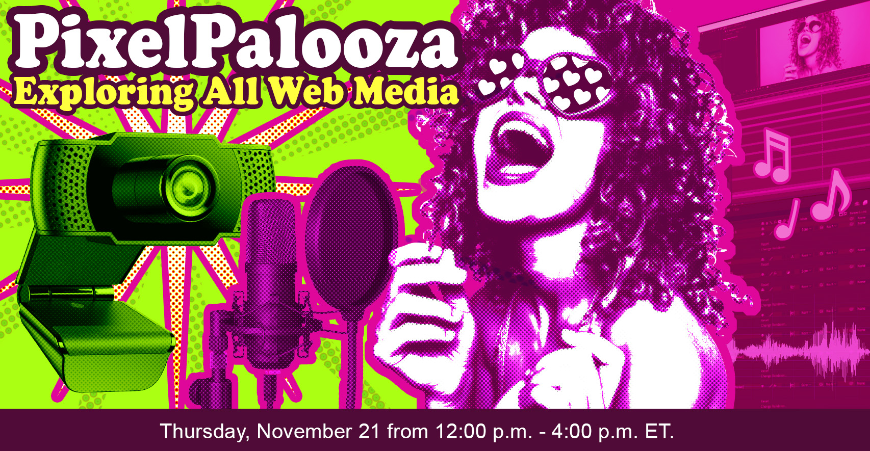
PixelPalooza will explore all the ways we, as developers, can leverage media like images, video, audio and documents across our sites and applications.